COP26 in Glasgow
This week I traveled to Glasgow to attend the 2021 United Nations Climate Change Conference, more commonly known as COP26. This was made possible by the generous support by the School of Geographical Sciences and the Cabot Institute for the Environment that provided additional funding to allow me to produce a new visualisation of what is at stake at COP26.
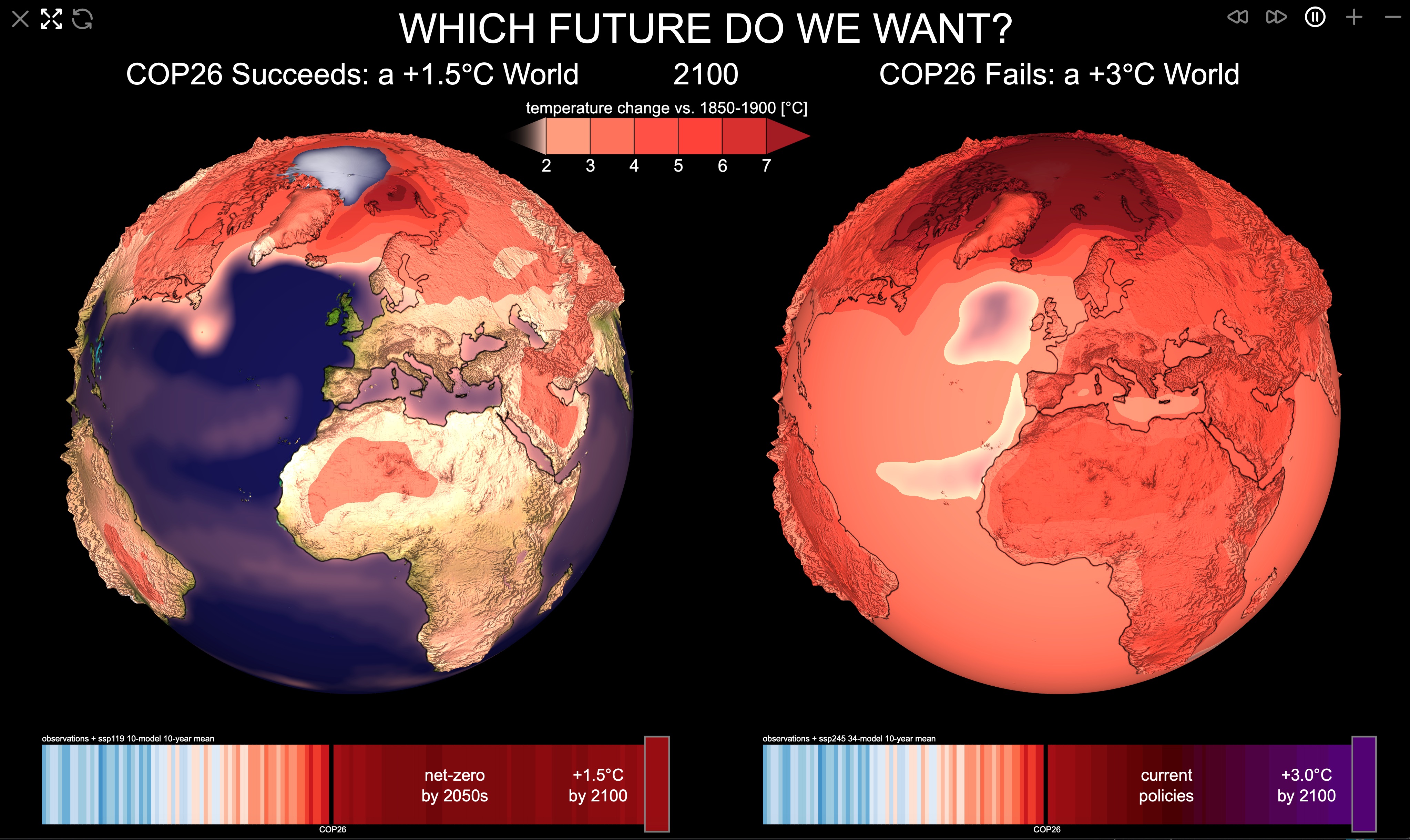
I am using my new climatearchive.org engine to display two CMIP6 ensemble mean projections for the rest of this century. One, that is consistent with the Paris goal to limit global mean surface warming in 2100 to about 1.5 °C (ssp119), and another that roughly follows current climate policies leading to a global mean warming of nearly 3 °C (ssp245). Both worlds are shown as 3D globes side-by-side with linked cameras/controls. This intuitive interface allows users to easily understand and compare the regional consequences of global climate targets. The warming stripes at the bottom are interactive and can be used to easily navigate through time. A screenshot and short demo video are below, the interactive version is available at climatearchive.org/cop26.
The visualisation was also featured in this weeks epiosode of BBC’s “Science in Action” programme where Dan Lunt and I met with Roland Pease to discuss the current climate emergency in the context of past, natural climate change.

I am at #COP26 today to remind people what is at stake in Glasgow. Ever looked at the data underlying these climate negotiations? Head over to https://t.co/VpHY0UcueT to explore what a +1.5°C or +3°C world means for your region.
— Sebastian Steinig (@sebsteinig) November 3, 2021
#ClimateEmergency @cabotinstitute @GeogBristol pic.twitter.com/7N4QXIaUbH
Public vs. scientific sessions
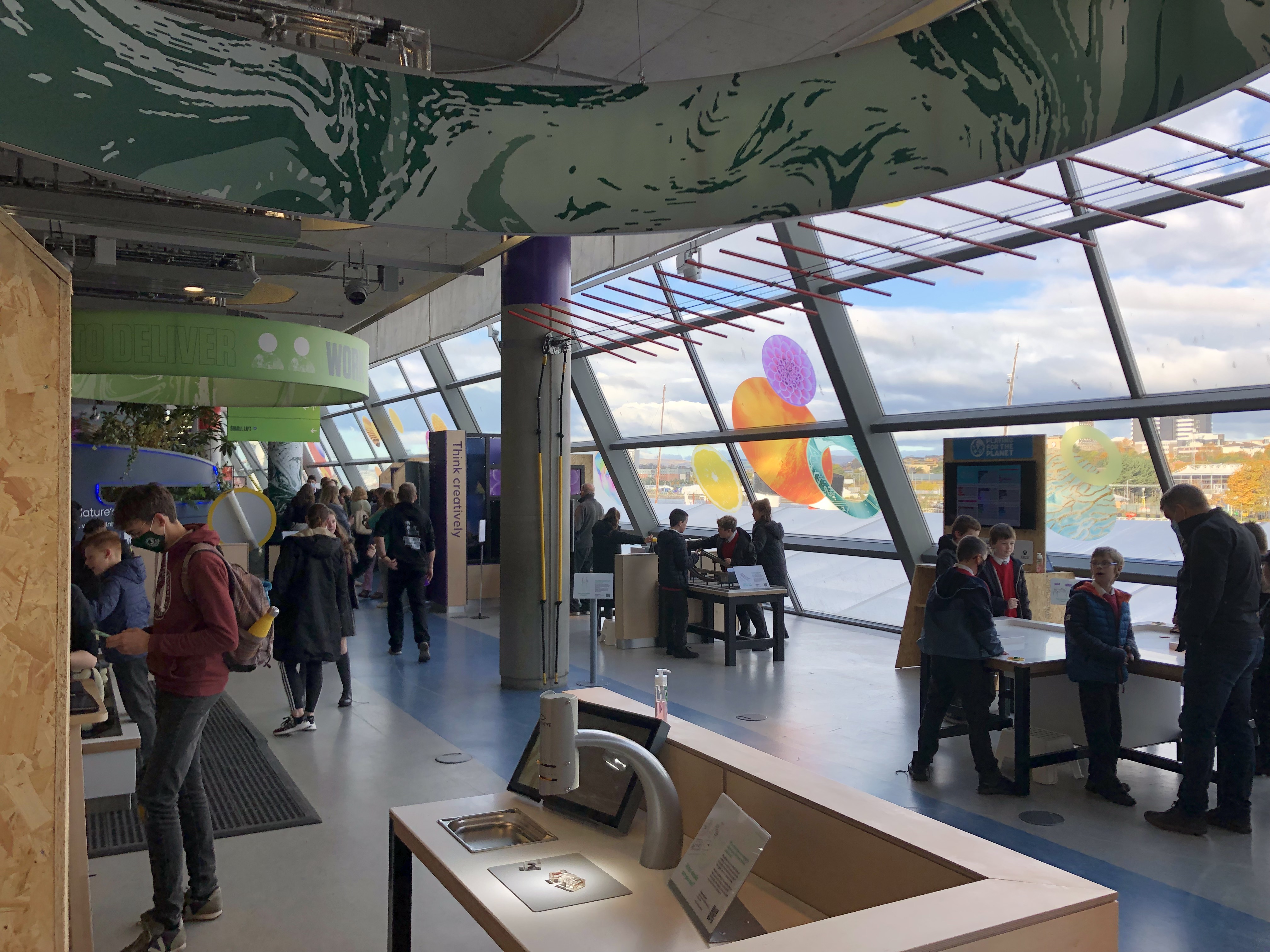
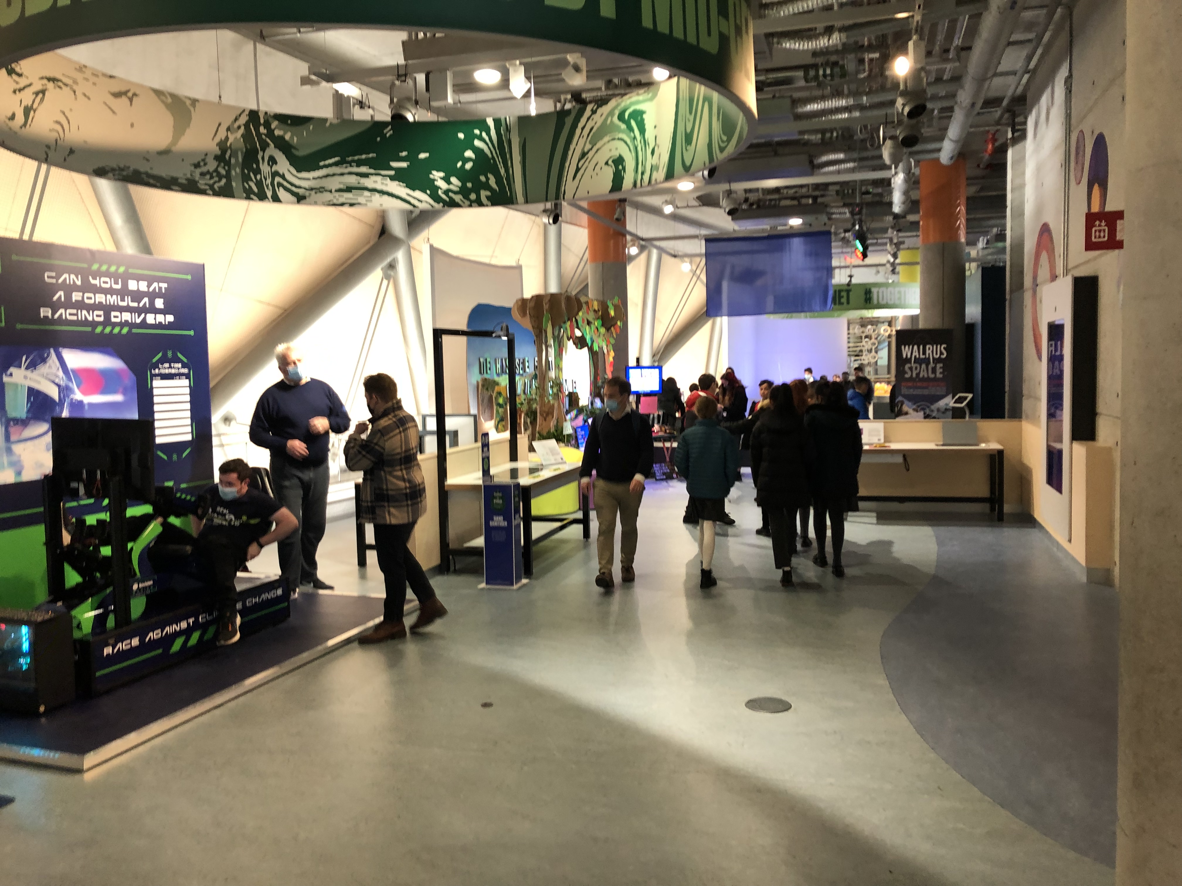
I presented the new interactive site in the COP Green Zone, which is more like a public science fair than a climate conference. This was great in terms of diverse audiences that tried the app (it was a big hit with school classes), but unfortunately, I could not identify a single politican wandering around the exhibition space.


Luckily, I was able to sneak some of the visuals into the actual scientific sessions in the COP Blue Zone, where the actual policymakers were :).
No one is at @SpeakerPelosi 's press conference because they are all packed in to @ClimateDann 's talk on climate impacts on health.
— Dan Lunt (@ClimateSamwell) November 10, 2021
Awesome graphics from @sebsteinig !#GlasgowCop26 #cop26@GeogBristol @cabotinstitute pic.twitter.com/Nwnqv1n5WW
Enjoy Reading This Article?
Here are some more articles you might like to read next: